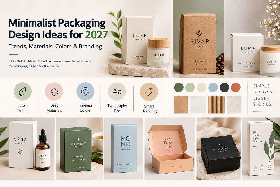
Minimalist packaging design in 2027 is moving beyond simply using fewer colors or placing a small logo on a plain box. Effective minimalism removes unnecessary visual and structural elements while keeping the information customers need to identify, understand and use the product.
For brands, this means combining clean layouts, purposeful white space, clear typography, restrained color palettes, simple structures and focused branding. Material choice also matters. Paperboard, kraft, recycled fiber and other paper-based materials can support a minimal appearance when they suit the product’s protection, printing and presentation requirements.The strongest minimalist packaging is therefore not the packaging with the least design. It is packaging where every visible element has a clear purpose.
What Is Minimalist Packaging Design?
Minimalist packaging design is an approach that reduces unnecessary graphics, colors, text and structural complexity so the product and brand message remain easy to understand. A minimalist package typically relies on a few carefully selected elements:
- Clear brand or product name
- Strong visual hierarchy
- Controlled use of white or negative space
- Limited color palette
- Readable typography
- Simple graphics or line art
- Functional box structure
- Purposeful material selection
Minimalism should not remove essential information. Product details, ingredients, instructions, warnings, barcodes and legally required information still need sufficient space and readability. The objective is clarity rather than emptiness.
Why Minimalist Packaging Will Matter in 2027
One of the most useful directions for packaging design in 2027 is purposeful simplification: reducing visual clutter, avoiding unnecessary components and making important information easier to find.
This direction can support several packaging goals at once.
| Minimalist Design Choice | Practical Benefit |
| Fewer visual elements | Makes the main message easier to identify |
| Clear typography | Improves information hierarchy and readability |
| Limited colors | Creates a more controlled visual identity |
| Right-sized structure | Can reduce unnecessary material and empty space |
| Simple graphics | Keeps attention on the product and brand |
| Fewer unnecessary components | Can simplify packing and disposal |
| Consistent design system | Helps products look related across a range |
However, minimalist packaging is not automatically better for every product. A design still needs to communicate enough information for the customer to understand what is being sold.A food package requiring nutritional and ingredient information, for example, needs a different information hierarchy from a jewelry box containing only a logo and product insert.
10 Minimalist Packaging Design Ideas for 2027
The following minimalist packaging ideas focus on practical design decisions rather than simply making packaging look empty.
1. Make White Space Part of the Design
White space in packaging design is the intentionally unused area around text, logos, images and other elements. It does not have to be physically white; a black, kraft, beige or colored background can still contain white space.Use it to separate important information and create a clear visual hierarchy.
Instead of filling every panel with:
- Product claims
- Decorative patterns
- Large photographs
- Multiple icons
- Repeated logos
- Promotional messages
Identify what the customer needs to notice first. For example, the front panel may need only:
Brand → Product Name → Key Product Detail
Secondary information can then move to the side or back panels.This creates a clean packaging layout without sacrificing useful information.
2. Build the Design Around One Clear Focal Point
Minimalist packaging works best when customers immediately know where to look.The focal point might be:
- Brand name
- Product name
- Logo
- Product illustration
- Distinctive typographic element
- Small product window
Avoid making the logo, product name, claims, graphics and promotional text compete at the same visual strength.A useful test is to look at the front of the package for a few seconds. If it is unclear which element should be read first, the visual hierarchy probably needs refinement.
3. Use a Restrained Color Palette
A minimalist packaging color palette does not have to mean black and white. The objective is to use colors deliberately rather than adding more colors simply to make the box noticeable.Possible approaches include:
- Black and white
- One dominant brand color
- Neutral shades
- Earth tones
- Muted colors
- Monochromatic variations
- Natural kraft with one printed color
A skincare brand, for example, could use warm white packaging with one muted accent color to separate different products. A natural soap brand might use kraft material with dark typography instead of applying full-surface printing.Color should help organize and identify the product rather than become visual noise.
4. Let Typography Do More of the Design Work
Minimalist packaging typography can become the primary visual element when photography and complex illustrations are reduced.
A strong typographic hierarchy may use:
Large: Product name
Medium: Product type or variant
Small: Supporting details
The important consideration is readability.Using several decorative fonts can undermine an otherwise clean design. A more controlled approach is to select one type family or a carefully matched pair and use size, weight and spacing to establish hierarchy.Large, well-positioned typography can also give simple packaging a distinctive identity without requiring additional graphics.
5. Replace Complex Graphics With Simple Line Art
Detailed illustrations can work well, but they are not necessary for every package.
Line art packaging design can communicate ingredients, product forms or brand themes using fewer visual elements.
For example:
- A tea box can use a small botanical drawing.
- A candle box can use a simple flame or fragrance illustration.
- Skincare packaging can use a restrained ingredient illustration.
- Food packaging can use a simplified representation of the product.
The illustration should support product recognition rather than function as decoration with no clear purpose.
6. Use Geometric Shapes With a Purpose
Simple circles, lines, grids and blocks can create structure without making the design visually heavy.
Geometric packaging design can be particularly useful for:
- Organizing product information
- Separating variants
- Framing a logo
- Creating a recognizable brand system
- Guiding the eye across the package
For a product range, the same structural layout can remain consistent while one shape or accent color changes between variants.This provides variety without losing brand consistency.
7. Make the Material Part of the Visual Identity
Minimalist packaging does not always need full-surface printing. The natural appearance of kraft paper, paperboard, recycled fiber or textured paper can become part of the design itself. For example, a kraft box with a small one-color logo may need fewer decorative elements because the material already provides color and texture.
Material should still be selected according to:
- Product weight
- Required protection
- Printing compatibility
- Moisture or barrier requirements
- Shipping conditions
- Desired customer experience
A natural-looking material is not automatically the right material for every product.
8. Keep Logo Placement Controlled
Making a logo larger does not always make branding stronger.Minimalist logo placement works when the logo has enough surrounding space and appears in a predictable position. Possible placements include:
- Centered on the front panel
- Small logo in the upper corner
- Logo on the lid with product information on the side
- Small repeated mark inside the package
Avoid repeating the logo across every visible panel unless repetition has a functional branding purpose.One clearly positioned brand mark can often be more memorable than several competing logos.
9. Reduce Structural Complexity
Minimalism can apply to the physical package as well as its graphics.A minimal packaging design may reduce unnecessary:
- Layers
- Sleeves
- Trays
- Oversized lids
- Decorative components
- Void space
Before adding another packaging component, ask:
Does it protect the product, provide required information, improve usability or create meaningful presentation value?
If the answer is no, the component may not be necessary.This approach can support a cleaner unboxing experience and, in some cases, reduce material consumption.
10. Use Subtle Finishes Instead of Combining Everything
Minimalist does not mean premium finishes must disappear.Foil stamping, embossing, debossing or a selective coating can work particularly well when applied to a small, intentional area.
For example:
- Deboss only the logo.
- Add foil to the product name.
- Emboss a small brand symbol.
- Use a tactile paper rather than multiple decorative effects.
The key is restraint.Combining foil, embossing, Spot UV, several colors and complex artwork on the same surface can move the design away from minimalism. Limiting finishes to one small area can also help keep packaging costs under control.
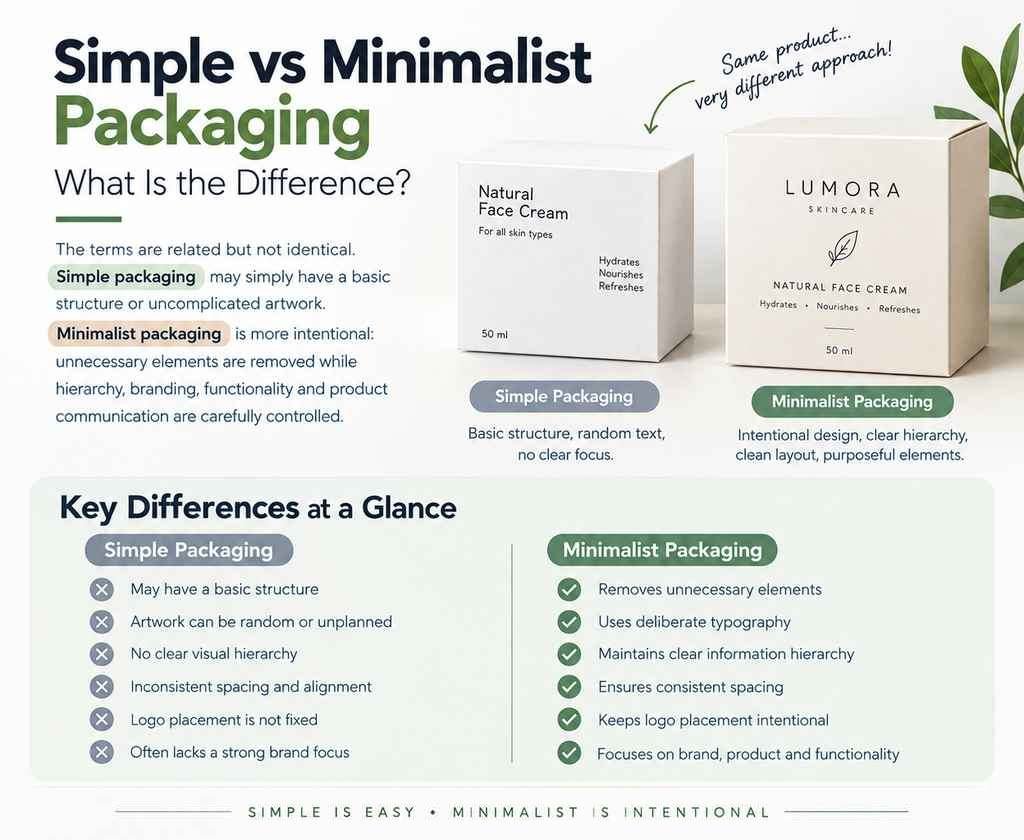
Simple vs Minimalist Packaging: What Is the Difference?
Minimalist Packaging Design Ideas for 2027: Trends, Materials, Colors & Branding
The terms are related but not identical.Simple packaging may simply have a basic structure or uncomplicated artwork. Minimalist packaging is more intentional: unnecessary elements are removed while hierarchy, branding, functionality and product communication are carefully controlled.For example, a plain white box with randomly positioned text is simple, but it is not necessarily good minimalist design. A better minimalist box might use the same white surface but apply:
- Deliberate typography
- Clear information hierarchy
- Consistent spacing
- Controlled logo placement
- One purposeful accent
- A structure sized correctly for the product
The difference is intentional design.
A Practical Minimalist Packaging Framework for 2027
Before approving a minimalist design, evaluate it across five areas:
| Area | Question to Ask |
| Clarity | Can customers quickly understand what the product is? |
| Hierarchy | Is it obvious which information should be read first? |
| Branding | Is the package recognizable without excessive logos or graphics? |
| Function | Does the structure protect and present the product properly? |
| Restraint | Does every color, graphic, finish and component have a reason to be there? |
If removing an element makes the package clearer without reducing protection, usability, required information or brand recognition, that element may not be necessary.That principle provides a stronger foundation for modern minimalist packaging in 2027 than simply following a visual trend.
Colors, Typography, Materials, Sustainability & Product-Specific Ideas
Once the basic structure of a minimalist package is clear, the next decisions involve color, typography, material, sustainability and product category. These elements should work together rather than compete for attention.A minimalist skincare box and a minimalist food package, for example, should not use exactly the same design approach. Both can look clean and modern while responding differently to product protection, labeling, shelf visibility and customer expectations.
Minimalist Packaging Color Trends for 2027
The strongest minimalist packaging colors are not necessarily the colors predicted to become fashionable for one year. A better approach is to build a restrained palette that supports brand recognition and remains usable across a product range.Four approaches work particularly well with minimalist packaging.
1. Neutral Color Palettes
White, cream, beige, grey and soft neutral shades create a clean foundation and leave room for typography or a small brand accent to become the focal point.Neutral packaging can work particularly well for:
- Skincare
- Cosmetics
- Jewelry
- Candles
- Wellness products
- Premium food products
However, brands should avoid using neutral colors simply because they look minimalist. If every competitor in a category uses nearly identical beige packaging, the design may become difficult to distinguish on a shelf.
2. Monochrome Packaging
Monochrome packaging design uses one main color or closely related shades rather than several competing colors. For example, a brand could use a deep green box with lighter and darker green typography and graphic elements.This keeps the design controlled while providing more personality than a plain white package.
3. Earth Tones and Natural Colors
Muted greens, browns, sand tones and other earth-inspired colors can complement kraft paper, recycled paper and natural product positioning.They are particularly suitable when the material itself remains visible.But color alone should never be used to imply that packaging is environmentally friendly. Sustainability claims should be supported by the actual material, structure and disposal options.
4. One Strong Accent Color
Minimalism does not require avoiding bright colors. A mostly neutral package can use one stronger accent for:
- Product variants
- Flavor identification
- Fragrance families
- Important information
- Small graphic elements
This can make a minimalist system easier to navigate without filling every surface with color.
How to Choose Colors for Minimalist Packaging
Instead of asking which color looks most minimalist, ask what each color needs to do.
| Design Goal | Useful Color Approach |
| Create a clean premium look | Neutral or controlled monochrome palette |
| Differentiate product variants | One changing accent color |
| Highlight natural material | Limited ink over kraft or uncoated paper |
| Create stronger shelf recognition | Distinctive brand color with simple graphics |
| Keep a large product range consistent | Fixed base palette with coded accents |
The best minimalist packaging color palette should remain recognizable when products are displayed individually as well as together.
Typography in Minimalist Packaging Design
When a package contains fewer graphics, typography becomes more visible. Small problems with font selection, spacing or hierarchy can therefore have a larger impact. Effective typography in packaging design should answer three questions quickly:
- What brand made this?
- What is the product?
- What important detail should I read next?
Keep the Type System Limited
Using one font family with several weights can often create enough hierarchy for minimalist packaging. Another option is a carefully controlled two-font system, such as:
Primary typeface: Brand and product names
Secondary typeface: Ingredients, instructions and supporting information
Adding more fonts should have a clear functional reason.
Prioritize Readability Over Appearance
Very thin type, extreme letter spacing or tiny text may look sophisticated on a digital mockup but become difficult to read once printed.Always evaluate typography at the package’s actual physical size.
Pay particular attention to:
- Font size
- Contrast
- Line spacing
- Letter spacing
- Print quality
- Background color
- Required regulatory information
Minimalism should make information easier to process, not harder to read.
Bold Typography Can Still Be Minimalist
A minimalist package does not need tiny typography.Bold typography packaging can create a strong focal point without relying on photographs, patterns or multiple graphics. A large product name against an uncluttered background can become the primary design feature.
The key is to give bold typography enough surrounding space rather than combining it with several equally dominant elements.
Best Materials for Minimalist Packaging
Material choice has a major influence on how minimalist packaging looks and feels.
Instead of covering every surface with graphics, designers can allow the natural color, texture or finish of the material to contribute to the visual identity.
Paperboard
Paperboard is widely used for folding cartons because it provides a smooth printable surface while remaining lightweight. It works well for minimalist:
- Cosmetics
- Skincare
- Food products
- Supplements
- Soap
- Small retail products
A clean paperboard carton can use typography, limited colors and selective finishes without requiring a complex structure.
Kraft Paper and Kraft Board
Minimalist kraft packaging uses the natural brown surface as part of the design.
It can work effectively with:
- Black ink
- White ink
- Simple line art
- Small logos
- Limited-color printing
Kraft is particularly useful when its natural appearance fits the brand. It should not be selected solely to create an artificial “eco” aesthetic.
Corrugated Board
Corrugated material is useful when minimalist packaging also needs to withstand shipping and handling.A minimalist mailer box might use a simple exterior logo with a small amount of information inside rather than full-surface printing on both sides. For e-commerce, this can combine structural protection with controlled branding.
Rigid Board
Minimalist rigid boxes are particularly suited to premium products. A rigid box may need very little printed artwork if its construction, paper wrap and tactile quality already communicate value.
For example:
Textured paper + small debossed logo + precise structure
can create a stronger premium impression than filling the box with decorative graphics.
Textured and Uncoated Papers
Texture can replace some visual decoration.Uncoated or lightly textured papers can provide a tactile surface that works well with:
- Debossing
- Embossing
- Small foil details
- Simple typography
- Restrained graphics
Before selecting a specialty paper, confirm that it works with the required printing method, durability and product environment.
Sustainable Minimalist Packaging: Where the Two Ideas Connect
Sustainable minimalist packaging should focus on measurable design decisions rather than appearance alone. A package is not environmentally responsible simply because it uses brown kraft paper, green colors or a recycling symbol.
A more meaningful approach considers:
- Amount of material used
- Product protection
- Package dimensions
- Number of components
- Recyclability
- Recycled content
- Material sourcing
- Coatings and laminations
- Ability to separate components
- Shipping efficiency
Minimalism can support sustainability when removing unnecessary components genuinely reduces material use.
Reduce Material Before Adding “Eco” Features
One of the most practical approaches to sustainable packaging design is to ask whether the package can accomplish the same job with less material. For example, evaluate whether you can:
- Reduce oversized dimensions
- Remove unnecessary sleeves
- Eliminate decorative trays
- Replace multiple components with one structure
- Reduce excessive void fill
- Use a lighter appropriate board grade
- Avoid unnecessary plastic windows
- Simplify material combinations
The package still needs to protect the product. Reducing material to the point where products are damaged during shipping can create additional waste rather than reduce it.
Design for Easier Recycling
A minimalist structure can also make disposal easier when it avoids unnecessary combinations of materials. For example, a paper-based package made primarily from one compatible material may be easier for customers to understand than a box permanently combining paper, plastic, foam and metallic decorative components. Where a protective insert is needed, molded pulp packaging can sometimes replace foam and keep the package paper-based. Actual recyclability depends on the specific material and local recycling infrastructure, so brands should avoid making broad environmental claims without evidence. This distinction strengthens trust and keeps sustainability messaging accurate.
Right-Sized Packaging as a Minimalist Design Principle
Right-sized packaging means designing the package around the actual dimensions and protection requirements of the product. Excessively large boxes can require:
- More material
- More void fill
- More storage space
- Greater shipment volume
Minimalist structural design should therefore consider the empty space inside the package, not only the graphics outside it.
The aim is not to create the smallest possible box. It is to create the smallest practical structure that still provides appropriate protection and usability.
Luxury Minimalist Packaging: How to Make Simple Packaging Look Premium
Luxury minimalist packaging relies more heavily on execution because there are fewer elements available to hide weak material or poor production quality. Premium minimalism can come from:
- Precise box construction
- High-quality paper
- Controlled typography
- Consistent spacing
- Subtle texture
- Clean edges
- Accurate color reproduction
- Selective premium finishing
Rather than adding several effects, choose one feature that deserves attention.
For example:
| Instead of | Consider |
| Foil + embossing + Spot UV + pattern | Small foil logo |
| Several decorative graphics | Strong typography |
| Multiple material layers | One high-quality tactile stock |
| Large repeated logos | One precisely positioned mark |
| Full-surface decoration | Subtle debossing |
This creates understated luxury packaging rather than visually overloaded premium packaging.
Minimalist Packaging Ideas by Product Type
Minimalism needs to adapt to the product. The following approaches show how the same design philosophy can work differently across industries.
Minimalist Cosmetic Packaging
Minimalist cosmetic packaging should make the brand, product type, shade or variant easy to identify while leaving enough space for required information. A practical approach could use:
- Neutral base color
- Clear product name
- Small brand mark
- Color-coded variant
- Limited graphics
- Consistent typography across the range
For products displayed together, consistency across cartons can be more valuable than making every individual box completely different.
Minimalist Skincare Packaging
Skincare products often need to communicate ingredients, product purpose, volume and usage information. A minimalist skincare packaging system can use the front panel for the most important information and move detailed instructions or ingredients to secondary panels.
For example:
Front: Brand + Product + Primary Function
Side/Back: Ingredients + Directions + Required Information
This maintains visual clarity without removing useful content.
Minimalist Jewelry Packaging
Jewelry is well suited to luxury minimalist packaging because the product itself can become the focal point once the box is opened. A jewelry box may use:
- Rigid structure
- Neutral or dark color
- Small foil or debossed logo
- Simple fitted insert
- Minimal exterior text
The insert should secure the product properly rather than functioning only as decoration.
Minimalist Candle Packaging
For minimalist candle packaging, fragrance identification is particularly important. A consistent box structure can use one changing design element for each scent, such as:
- Accent color
- Small botanical illustration
- Fragrance name
- Simple symbol
This keeps the range visually connected while helping customers distinguish variants.
Minimalist Soap Packaging
Soap packaging can benefit from material reduction when product requirements allow it. Possible approaches include:
- Kraft carton with one-color printing
- Simple paper sleeve
- Folding carton with a small die-cut window
- Minimal line illustration
- Clear scent or ingredient hierarchy
The structure still needs to account for hygiene, moisture, product protection and applicable labeling requirements.
Minimalist Food Packaging
Minimalist food packaging design requires more careful information management because food products may need ingredients, allergens, nutritional information, storage instructions and other required details.Minimalism should therefore organize information rather than remove it.
Use clear hierarchy to separate:
Brand → Product → Variant → Key information → Detailed information
Regulatory and safety information should never be reduced simply to preserve a minimalist appearance.
Minimalist E-Commerce Packaging
For e-commerce, the package must first survive distribution. A minimalist e-commerce packaging approach can use:
- Right-sized corrugated structure
- Small exterior logo
- Limited printing
- Easy opening
- Reduced unnecessary inserts
- Simple internal brand message
An elaborate unboxing experience is not automatically a better one. Easy opening, secure product placement and straightforward disposal can be more valuable than several decorative layers.
How to Choose the Right Minimalist Style for Your Product
Before selecting a minimalist packaging direction, match the design to the product rather than copying an attractive example from another industry.
Use these five criteria:
| Consideration | What to Evaluate |
| Product | Size, weight, fragility and protection needs |
| Customer | Information they need before buying |
| Brand | Existing colors, typography and visual identity |
| Sales environment | Retail shelf, e-commerce, gifting or direct sale |
| Compliance | Required labeling, warnings and product information |
A successful modern minimalist packaging design balances all five. If a design looks clean but makes the product difficult to identify, fails to protect it, hides important information or feels unrelated to the brand, it is not effective minimalism.
How Minimalist Packaging Can Strengthen Brand Identity
Strong minimalist packaging branding uses fewer elements consistently. Instead of relying on several patterns, illustrations and promotional messages, a brand can build recognition around a controlled visual system.
That system may include:
- Consistent logo placement
- Recognizable typography
- One core color palette
- Defined spacing
- Consistent product-name hierarchy
- A recurring structural feature
- One recognizable illustration style
- A distinctive material or finish
Consistency becomes especially important when a business sells several related products.
For example, a skincare brand could keep the same white paperboard carton, typography and logo position across its entire range while changing only one accent color and the product name. Customers can identify the brand while still distinguishing individual products.
Minimal Branding Does Not Mean Invisible Branding
One common mistake is reducing branding so much that the package becomes indistinguishable from competitors. A tiny logo on a plain beige box is not automatically a strong minimalist design. The package should still contain a recognizable visual element. That could be a distinctive:
typeface, brand color, structural shape, logo position, illustration style or material treatment.
The objective of minimal branding packaging is to remove unnecessary elements while protecting the features customers associate with the brand.
Use Logo Placement to Create Recognition
A logo needs space to remain visible, but it does not need to dominate every panel. Effective minimalist logo placement can include:
- Center of the main panel
- Upper-left or upper-right corner
- Center of a rigid box lid
- Small mark on the exterior with a larger reveal inside
- Consistent position across an entire product range
Once a position is selected, consistency can help make the packaging more recognizable. Repeatedly changing logo size and placement between products can weaken an otherwise coherent visual identity.
Can Minimalist Packaging Improve the Unboxing Experience?
Yes, but a minimalist unboxing experience should prioritize ease and presentation rather than the number of layers customers remove. A useful unboxing sequence might be:
Open → See the product → Access it easily → Understand any instructions → Dispose of or recycle the packaging appropriately
This can be more effective than requiring customers to remove several sleeves, cards, tissue layers and decorative components.
A minimalist unboxing experience can focus on:
- Easy opening
- Secure product placement
- Clean internal presentation
- Limited unnecessary components
- Short, useful messaging
- Clear disposal information
The customer should feel that each custom packaging element has a reason to exist.
Minimalist Packaging for Better Shelf Appeal
Minimalism can create packaging shelf appeal through contrast. On a shelf filled with busy graphics and competing messages, a controlled package with clear typography and intentional space can stand out precisely because it looks different. However, the opposite can also happen. If most competitors already use white boxes, black typography and neutral palettes, another similar design may disappear into the category. Before finalizing the design, compare it against actual competing products.
Ask:
- Does it look recognizably different?
- Can the product name be read quickly?
- Is the variant easy to identify?
- Does it still look like our brand?
- Is important information visible at normal viewing distance?
Minimalism should improve differentiation, not create sameness.
Minimalist Packaging for Small Businesses
Minimalist packaging for small businesses can be practical because a strong design does not necessarily require multiple printing processes and premium finishes. A small brand can start with:
- One standard structure
- One or two brand colors
- Clear typography
- Simple logo placement
- Limited print coverage
- One material that suits the product
- Consistent labels or printed variants
This can create a cohesive product range without designing an entirely different packaging system for every SKU. When the business grows, premium elements such as embossing, debossing, foil or custom inserts can be introduced selectively where they provide meaningful value.
8 Common Minimalist Packaging Design Mistakes to Avoid
Minimalist design appears simple, which can make execution errors particularly noticeable.
1. Removing Too Much Information
Minimalism should improve information hierarchy, not eliminate information customers need. Ingredients, directions, warnings, dimensions, quantity, product variants and regulatory information should remain available where applicable.
2. Making Text Too Small
Tiny text is not a requirement of minimalist design. If customers struggle to read the packaging, visual simplicity has been prioritized over usability. Check typography at the actual printed size, not only on a large computer screen.
3. Copying the Same Neutral Look as Every Competitor
Beige, white, black and muted colors are common in modern minimalist packaging. Using them without a distinctive brand element can make products look generic. Retain at least one recognizable element such as color, typography, illustration, structure or logo treatment.
4. Using “Natural” Design as Proof of Sustainability
Brown kraft paper, leaves and green graphics can create a natural appearance, but appearance does not establish environmental performance. Any sustainability claim should reflect the actual materials, sourcing, structure and applicable disposal route.
5. Choosing Appearance Over Product Protection
Reducing packaging material is useful only when the resulting package can still protect the product. A fragile product damaged because its packaging was made too light creates product loss and additional waste.
6. Adding Too Many Premium Finishes
Foil, embossing, debossing, Spot UV and textured stocks can all complement minimalist packaging individually. Using all of them together can remove the restraint that makes minimalism effective. Choose the finish that contributes most to the intended experience.
7. Ignoring the Back and Side Panels
A clean front panel does not compensate for poorly organized information elsewhere.Apply the same typography, spacing and hierarchy principles across every panel.
8. Designing Only for Digital Mockups
A packaging concept may look excellent as a large 3D render but perform differently when printed at actual size. Before full production, evaluate a physical sample for:
- Text readability
- Color reproduction
- Material feel
- Structural strength
- Opening experience
- Logo visibility
- Finish quality
Physical testing provides stronger evidence than relying solely on an on-screen design.
Minimalist Packaging Design Checklist for 2027
Before approving a design, check the following:
- Can customers identify the product quickly?
- Is the brand clearly recognizable?
- Does the design have one obvious visual hierarchy?
- Is all important text readable at actual size?
- Are the colors purposeful rather than decorative?
- Is white or negative space used intentionally?
- Are typography styles limited and consistent?
- Does every graphic have a clear role?
- Is the material appropriate for the product?
- Is the box properly sized?
- Have unnecessary packaging components been removed?
- Does the structure provide enough protection?
- Are sustainability claims accurate and supportable?
- Are required labels and product details easy to find?
- Does the packaging remain recognizable beside competitors?
- Does the design work across different product variants?
- Are premium finishes being used selectively?
- Has a physical sample been tested before full production?
Final Takeaway: What Will Define Good Minimalist Packaging in 2027?
The strongest minimalist packaging design in 2027 will not be defined simply by white backgrounds, neutral colors or small logos. It will be defined by how effectively a package removes unnecessary elements while preserving brand recognition, product clarity, functionality and visual character. Good minimalist packaging should use color deliberately, establish hierarchy through typography, select materials according to actual product requirements and simplify structures where doing so does not compromise protection.
Sustainable minimalism should also be based on measurable decisions—such as reducing unnecessary material, right-sizing packages and considering recyclability—rather than relying on an eco-inspired visual style.For brands, the most useful principle is simple:
Do not ask how little design you can use. Ask how few elements you need to communicate the product clearly and memorably.
Frequently Asked Questions About Minimalist Packaging Design
What is minimalist packaging design?
Minimalist packaging design removes unnecessary visual and structural elements while keeping the branding, product information and functionality customers need. It commonly uses clear typography, intentional white space, limited colors, simple graphics and carefully selected materials.
What are the key minimalist packaging trends for 2027?
Useful directions for minimalist packaging trends in 2027 include restrained color systems, typography-led layouts, right-sized structures, reduced unnecessary components, tactile paper surfaces, simple line graphics and more deliberate use of materials and finishes. Brands should adopt these approaches only when they support the product and existing brand identity.
Why is minimalist packaging popular?
Minimalist packaging can make product information easier to understand, create a controlled visual identity and help brands reduce unnecessary design elements. It can also provide strong shelf contrast in categories dominated by visually busy packaging.
What makes packaging look minimalist?
A package generally looks minimalist when it combines clear hierarchy, limited colors, controlled typography, purposeful negative space and restrained graphics. Structural simplicity and selective finishing can reinforce the same approach.
What colors are best for minimalist packaging?
There is no single best color. Neutral shades, monochrome palettes, earth tones and black-and-white combinations are common, but a bold brand color can also work. The best palette is one that creates clarity while remaining distinctive and consistent with the brand.
Is minimalist packaging always white?
No. Minimalist packaging can use black, kraft brown, bold colors, muted shades or monochromatic palettes. Minimalism is based on purposeful use of design elements rather than a specific background color.
What materials work best for minimalist packaging?
Paperboard, kraft board, corrugated board, rigid board and textured or uncoated papers can all work with minimalist packaging design. The appropriate material depends on product weight, fragility, shipping conditions, printing requirements and desired presentation.
Is minimalist packaging sustainable?
Minimalist packaging can support sustainability when it reduces unnecessary materials, components or shipment volume. However, minimalist appearance alone does not make packaging sustainable. Actual materials, recyclability, sourcing, product protection and local disposal infrastructure also matter.
How can minimalist packaging reduce waste?
It may reduce waste through right-sizing, removing unnecessary sleeves or inserts, reducing excessive void fill and simplifying material combinations. Any reduction should still provide sufficient product protection.
How can I make simple packaging look premium?
Focus on execution rather than adding more decoration. Precise construction, high-quality material, strong typography, controlled spacing and one selective finish—such as foil, embossing or debossing—can make simple luxury packaging feel premium without creating visual clutter.
Is minimalist packaging suitable for small businesses?
Yes. Small businesses can build a recognizable packaging system around one practical structure, limited colors, consistent typography and controlled logo placement. This can provide brand consistency without requiring several complex decorative processes.
How do you design minimalist packaging?
Start by identifying the information customers need first. Establish a clear hierarchy, choose a restrained color and typography system, remove graphics without a functional purpose, select an appropriate material and simplify the structure where possible. Then test the packaging at its actual printed size.
Does minimalist packaging improve brand recognition?
It can when the reduced design elements are used consistently. A recognizable typeface, brand color, logo position, structural feature or illustration style can become more noticeable when unnecessary visual elements are removed.
How do you use white space in packaging design?
Use white space to separate the logo, product name, claims and supporting information so they do not compete for attention. White space can be any unused background area; it does not have to be physically white.
What is the difference between simple and minimalist packaging?
Simple packaging may have few elements because the design itself is basic. Minimalist packaging intentionally removes unnecessary elements while carefully controlling hierarchy, branding, typography, spacing and functionality.
Can luxury packaging be minimalist?
Yes. Luxury minimalist packaging can rely on precise construction, premium paper, restrained typography, tactile texture and one carefully chosen finish rather than multiple decorative effects. This approach is often described as understated luxury.