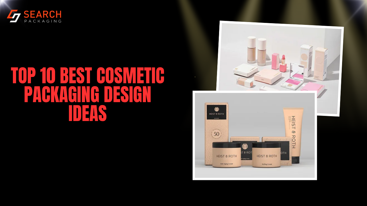
A shopper decides whether to pick up lipstick or a serum in a few seconds, and the box does most of the talking. This guide covers 10 cosmetic packaging design ideas that work on real paperboard, which products each one suits, and what it takes to print them for a beauty brand in the USA.The boxes that sell best are not always the most expensive ones. They are the ones where the structure fits the product, the finish matches the price point, and the printed details are easy to read on a crowded shelf or a phone screen.
Every idea below is built around practical materials and box structures, including SBS paperboard, kraft, rigid board, and corrugated board. That means you can evaluate each idea as a working packaging option, not just save it to a mood board.
What Is Cosmetic Packaging Design?
Cosmetic packaging design is the planning of a beauty product’s box: its structure, material, printing, finish, and label content. Good design protects the product, tells shoppers what it is and who it is for, and leaves room for the information US rules require on cosmetics sold to consumers.
It helps to separate two layers. The jar, tube, or bottle that touches the formula is the primary packaging. The printed carton around it is the secondary packaging, and that outer box is where most of your branding, shelf appeal, and required label text lives. This guide focuses on that outer box.
Why Does Beauty Packaging Design Matter So Much?
The box is your first sales pitch. On a retail shelf it sits next to dozens of competing products, and in an online listing it often becomes the main product photo. A clear shape, a strong color, and a readable name do more work here than any amount of decoration.
The box also protects what’s inside. Glass dropper bottles, pressed powder compacts, and lipstick bullets can crack or shift in transit, so the right structure and insert matter as much as the artwork.
Finally, the box carries information. For cosmetics sold in the United States, details like the product identity, net quantity, ingredient list, and business information generally need to appear in the required locations on the package. A design that crowds these out creates problems at print stage. We’ll cover this in more detail later in the guide.
The 10 Ideas at a Glance
| Design Idea | Best For | Box Style |
| Minimal white box with a foil stamped logo | Lipstick, mascara | Tuck end box |
| Window cutout that shows the shade | Lip gloss, nail polish | Tuck end box with window |
| Kraft box with earthy, low ink printing | Clean and vegan skincare | Kraft tuck end or sleeve |
| Rigid box with a magnetic closure | Luxury sets, fragrance | Rigid magnetic box |
| Tall carton with a snug neck insert | Serums, dropper bottles | Tuck end box with insert |
| Embossed perfume box on textured stock | Perfume, body mist | Rigid box or folding carton |
| Slim sleeve and tray for palettes | Eyeshadow and blush palettes | Sleeve and tray box |
| PR mailer with inside printing | Influencer kits, launches | Mailer box |
| Gift set box with fitted compartments | Holiday and bundle sets | Two piece box with insert |
| Color coded system across a product line | Skincare ranges | Matching folding cartons |
10 Cosmetic Packaging Design Ideas That Work on Real Boxes
Each idea below includes what it is, why it works, the products it suits, and one production tip so the design survives the move from screen to finished box.
1. Minimal White Box With a Foil Stamped Logo
A clean white box with one bold element, usually a foil stamped logo or product name, is one of the most reliable choices for lipstick box design. The empty space makes the brand name the hero, and a single metallic accent in gold, rose gold, or silver signals quality without a busy layout.
This style suits lipstick, mascara, eyeliner, and brow pencils, where the box is narrow and there is little room for anything beyond the name and shade. It also keeps costs manageable because you are printing few colors and adding just one finish.
Production tip: Keep foil away from fold lines and very thin type. Foil can crack on a crease, and fine serif details tend to fill in. A slightly heavier font weight for the foiled text prints far more cleanly.
2. Window Cutout That Shows the Shade
One of the most practical lip gloss packaging ideas is a die cut window that lets shoppers see the actual color before they buy. For shade driven products, this solves a real problem: people want to know exactly what they’re getting, and a printed swatch never matches perfectly.
Cosmetic window box packaging works well for lip gloss, nail polish, tinted balms, and any product sold in a clear tube or bottle. The window shape can echo your brand, such as an arch, a circle, or a teardrop, which turns a functional detail into a recognizable one.
Production tip: Position the window over the product itself, not over the cap, so shoppers see the formula. You can leave the cutout open to keep the box fully paper based, or add a clear film if the product needs dust protection on the shelf.
3. Kraft Box With Earthy, Low Ink Printing
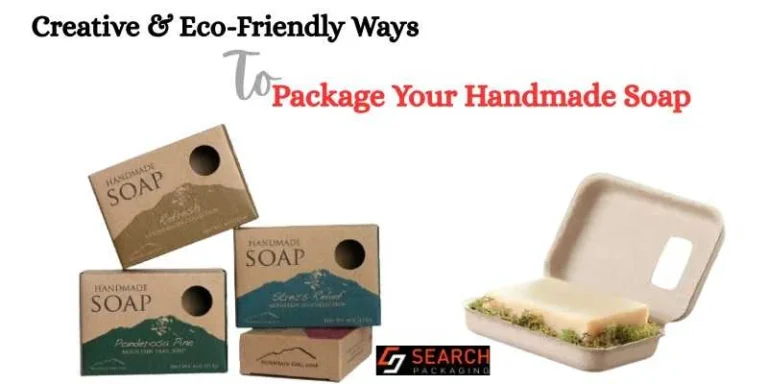
Kraft cosmetic boxes have become the default look for clean, vegan, and natural skincare brands. The natural brown paperboard tells shoppers “simple ingredients” before they read a word, and one or two ink colors are usually all the design needs.
This is also one of the easiest eco-friendly cosmetic packaging choices to make. Kraft paperboard is widely recyclable, and a low ink layout reduces coverage further. If you want another fiber-based option, molded pulp packaging is worth a look. It works for soaps, balms, body butters, bath salts, and minimal skincare lines.
Production tip: Uncoated kraft absorbs ink, so colors print darker and more muted than they look on your monitor. Black, deep green, and white ink read best. Avoid soft pastels or small reversed text, because both lose contrast on brown board.
4. Rigid Box With a Magnetic Closure
When the goal is a premium feel, rigid boxes are the strongest of all luxury cosmetic packaging ideas. The box is made from thick chipboard wrapped in printed paper, so it feels solid in the hand and doesn’t flex. A hidden magnet in the lid gives a satisfying snap every time it closes.
Magnetic closure makeup boxes suit high end skincare sets, fragrance, brush collections, and limited editions. Many customers keep these boxes for storage, which means your logo stays on their vanity long after the product is gone.
Production tip: Rigid boxes cost more per unit and take up more shipping space because they don’t fold flat. Reserve them for products with the margin to support them, and use a standard folding carton for everyday items in the same line.
5. Tall Carton With a Snug Neck Insert
Serum box packaging has one job above all others: keeping a glass dropper bottle from moving. A tall tuck end carton paired with a paperboard insert that grips the bottle’s neck holds it upright and stops the rattle that makes shoppers suspect something is broken.
This design fits serums, facial oils, ampoules, and any product in a slim bottle with a dropper or pump. The tall front panel also gives you generous space for the product name and key benefit, which is useful for skincare shoppers who compare labels closely.
Production tip: Measure the bottle with the dropper cap on, and measure the widest point of both the bottle and the cap. Most fit problems come from measuring the bottle body alone.
6. Embossed Perfume Box on Textured Stock
Some of the best perfume box packaging ideas skip heavy printing entirely and rely on touch. Embossing raises the logo or a pattern above the surface, while a textured or linen paper stock gives the box a crafted, tactile feel. Customers often run a finger across it before they even open it.
This idea suits perfume, body mist, cologne, and scented oils, where the scent can’t be experienced through the box, so the packaging has to create a mood. A deep color with a blind emboss (no ink, just raised texture) looks especially refined.
Production tip: Embossing needs a thicker board to hold its shape, and very fine patterns can flatten. Bold, simple shapes emboss best. If you want both foil and embossing on the same logo, use registered foil embossing so the two line up exactly.
7. Slim Sleeve and Tray for Palettes
Eyeshadow palette packaging works well with a two part structure: a printed sleeve that slides over an inner tray. Pulling the tray out creates a small reveal moment, and the sleeve can carry the full shade story, artwork, and required label text while the tray stays simple.
This format is a strong fit for eyeshadow palettes, blush and bronzer duos, highlighter sets, and face palettes. It keeps the product flat and protected, and it photographs well for online listings.
Production tip: Leave a little clearance between the sleeve and tray so the slide feels smooth. Too tight and customers tear the sleeve; too loose and the tray slips out on its own. Check this on a physical or digital structural proof before production.
8. PR Mailer With Inside Printing
Cosmetic PR box ideas are about the moment the lid lifts. A sturdy mailer box with plain or lightly printed outer walls and a fully printed interior creates a surprise when influencers, press contacts, or first customers open it. Many of them film that moment, so the inside of the box becomes part of your marketing.
Mailer boxes suit launch kits, influencer seeding, subscription boxes, and direct to consumer orders. Printing a short thank you message or a social handle inside the lid gives unboxing videos a natural focal point.
Production tip: Use corrugated board, typically E flute, for anything shipping through carriers. It adds real crush protection while staying thin enough for clean printing on both sides.
9. Gift Set Box With Fitted Compartments
Makeup gift box ideas work best when every product has its own place. A two piece box or rigid box with a custom die cut paperboard insert holds each item in a fitted slot, so the set looks curated the moment it opens and nothing shifts in transit.
This design is ideal for holiday collections, bridal and bridesmaid sets, trial size kits, and bundles that pair a cleanser, serum, and moisturizer. The insert can also include a printed card explaining the routine order, which adds value customers actually use.
Production tip: Measure every product in the set, including caps and closures. A single item that is a few millimeters off can make the entire insert unusable, so inserts should be built around real dimensions, not estimates.
10. Color Coded System Across a Product Line
For brands with several products, skincare packaging design often works best as a system rather than a series of individual boxes. Keep the same layout, typography, and logo placement on every carton, and change one accent color per product or skin concern. Shoppers learn to find their product by color within seconds.
This approach is especially helpful for skincare ranges, hair care lines, and growing makeup brands that plan to add more products over time. It also saves design effort, since each new box starts from an approved template.
Production tip: Ask for Pantone matching on your accent colors rather than standard CMYK when exact color consistency matters. It can help keep each shade consistent across print runs, so the blue on your moisturizer box doesn’t drift from the blue on your cleanser box six months later.
How to Choose the Right Cosmetic Packaging Design for Your Product
The best idea on this list is the one that fits your product first and your brand second. Start with the container’s shape, weight, and fragility, then choose the look. Use this table as a starting point when planning your cosmetic packaging design ideas around real products.
| Product Type | Box Style | Material | Insert |
| Lipstick, mascara, eyeliner | Tuck end box | 14pt to 18pt SBS paperboard | Usually not needed |
| Lip gloss, nail polish | Tuck end box with window | 14pt to 18pt SBS paperboard | Usually not needed |
| Serum, facial oil (dropper bottle) | Tall tuck end box | 18pt to 24pt SBS paperboard | Neck insert |
| Face cream, body butter (jar) | Tuck end or two piece box | 18pt to 24pt SBS paperboard | Cradle insert |
| Perfume, cologne | Rigid box or folding carton | Chipboard wrapped in textured paper | Cradle insert |
| Eyeshadow and blush palettes | Sleeve and tray box | 16pt to 18pt SBS paperboard | Usually not needed |
| Soap, balm, bath products | Kraft sleeve or tuck end | Kraft paperboard | Usually not needed |
| Gift sets and bundles | Two piece or rigid box | Chipboard | Die cut paperboard compartments |
| PR and influencer kits | Mailer box | E flute corrugated board | Paperboard dividers |
A heavier product needs a thicker board, and anything made of glass needs an insert. If a product will ship directly to customers, plan for an outer mailer or choose corrugated board from the start.
Also consider how the packaging will be used after purchase. For ecommerce products, prioritize protection, efficient dimensions, and an unboxing experience. For retail products, focus more heavily on shelf visibility, readability, and consistent product-line design. If sustainability is part of the brand promise, consider the material, coatings, inserts, and how easily the finished package can be separated and recycled.
What Must Be Printed on Cosmetic Packaging in the USA?
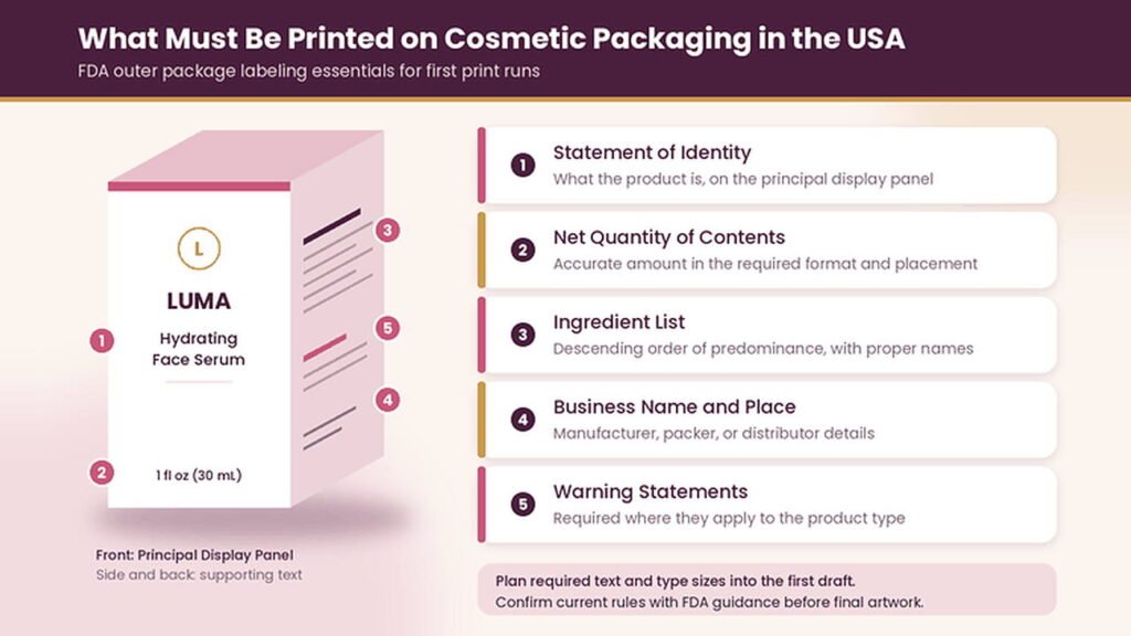
This is the part most design inspiration articles skip, and it is where many first print runs go wrong. For cosmetics sold to consumers in the United States, FDA labeling rules generally require the following on the outer package:
- Statement of identity: what the product is, such as “hydrating face serum,” placed on the principal display panel.
- Net quantity of contents: an accurate statement of the product quantity in the required format and placement.
- Ingredient list: in descending order of predominance, using appropriate ingredient names.
- Business name and place of business: of the manufacturer, packer, or distributor, with the required business information.
- Warning statements: where they apply to the product type.
These elements need space, and they have minimum type size and placement rules. Plan them into the layout from the first draft instead of squeezing them onto a side panel at the end. Minimalist packaging design works beautifully when the back and side panels are planned to carry the required text.
Cosmetic labeling requirements can also depend on the product and its intended claims. Labeling rules are updated from time to time, so confirm current requirements with FDA guidance or a regulatory consultant before you approve final artwork.
Cosmetic Packaging Ideas for Small Business Budgets
A small brand can look polished without paying for every finish. The key is spending where shoppers notice and saving everywhere else.
Pick one box structure and use it across your whole line, changing only the colors or product names. That keeps artwork simple and makes your products look like a family on the shelf. Choose one premium finish instead of three. A single foil logo or a soft touch coating on the front panel often has more impact than foil, embossing, and spot UV combined.
Put your biggest investment into your hero product, the one that drives most of your sales, and keep supporting items in a simpler version of the same design. As your line grows, you can upgrade box by box instead of redesigning everything at once.
How Much Do Custom Cosmetic Boxes Cost?
Custom cosmetic box pricing depends on a handful of factors: box size, board type and thickness, order quantity, number of print colors, finishes like foil or embossing, and whether you need inserts. Rigid boxes cost more than folding cartons because they use more material and more hand assembly.
The fastest way to estimate your packaging budget is to compare the box dimensions, material, quantity, printing, finishes, and insert requirements together. Small structural changes, such as switching from a two piece box to a tuck end, can shift the price noticeably.
How to Plan Your Custom Cosmetic Boxes in 4 Steps
Step 1: Define your specifications. Measure your product dimensions, choose the box style, estimate quantity, and list any finishes you have in mind.
Step 2: Choose the structure and material. Match the board and box construction to the product’s weight, fragility, size, and shipping requirements.
Step 3: Prepare and review the artwork. Build the design on the correct dieline and check the layout, colors, label text, and required information before production.
Step 4: Review the final proof. Check dimensions, folds, artwork placement, text, colors, and product fit before approving the final packaging.
For more packaging guides and practical information, SearchPackaging covers packaging structures, materials, printing, and design considerations for different product categories.
Final Thoughts on Cosmetic Packaging Design
Great cosmetic packaging design comes down to three decisions made in the right order: a structure that protects the product, a look that fits your brand and price point, and a layout that leaves room for the information shoppers and regulators expect. The 10 ideas above give you a starting point for each type of beauty product, from a simple lipstick carton to a full holiday gift set.
The strongest designs balance appearance with function. A beautiful box still needs to fit the product, survive handling, communicate the product clearly, and leave enough room for required information.
Frequently Asked Questions
How do you design cosmetic packaging from scratch?
Start by measuring your product container, then define your target customer and price point. Choose a box structure that fits the product, build the artwork on the printer’s dieline, and plan space for required label text before adding decorative elements. Always review a proof before approving production.
What thickness of paperboard should cosmetic boxes use?
Most small cosmetics like lipstick and mascara work well in 14pt to 18pt paperboard. Heavier items such as glass serum bottles and cream jars usually need 18pt to 24pt board, often with an insert. Rigid chipboard or corrugated board is better for premium sets and shipped orders.
What colors work best for cosmetic packaging?
The best colors match your brand positioning and product category. Soft neutrals and white suggest clean and gentle formulas, black and deep jewel tones suggest luxury, and bright colors suit playful makeup lines. Strong contrast between the background and the product name matters more than the color itself.
Is soft touch lamination recyclable?
Soft touch lamination is a thin plastic film bonded to the paperboard, which can make boxes harder to recycle in some local programs. If recyclability is a priority, consider an aqueous coating instead, which gives a smooth finish while keeping the box easier to process.
What is a dieline, and why does my cosmetic box need one?
A dieline is the flat template that shows a box’s cut lines, folds, and panels. Designing your artwork on the correct dieline makes sure text, logos, and images land on the right panels and don’t get cut off or wrap around a fold.
Do cosmetic boxes need a barcode?
FDA rules do not require a barcode, but most retailers and online marketplaces may require one for product identification and inventory systems. If you plan to sell through stores or large marketplaces, you’ll typically need a UPC barcode issued through GS1, and it should be printed on a flat panel with enough contrast to scan.
Can I use the same box design for different product sizes?
Yes, and it’s a smart way to build a consistent line. Keep the same layout, fonts, and colors, and adapt the design to each box size. Just adjust the artwork on each size’s own dieline so the proportions and required label text still fit correctly.
What makes cosmetic packaging stand out on the shelf?
Shelf impact usually comes from one clear focal point, such as a bold product name, a distinctive color, or an unusual window shape. Boxes that try to highlight everything tend to blend in. Test your design by viewing it from a few feet away next to competitor products.
Should my box design match the product container?
It should feel related, but it doesn’t need to be identical. Repeating the container’s main color, logo placement, or typography on the box creates a connected look when the customer opens it. The box can carry more detail, since it has more surface area than most containers.